When it comes to designing or refreshing your home, the colors you choose play a significant role in shaping the overall mood. Calm colors help create a peaceful environment where you can relax, recharge, and feel at ease. Whether you’re repainting a single room or your entire house, selecting the right calm colors requires thoughtful consideration. This guide offers practical tips for choosing colors that promote tranquility in your home.
Why Choose Calm Colors?
Calm colors typically include soft, muted tones that are easy on the eyes. They have the ability to reduce stress and promote a sense of harmony. Unlike bold or bright colors that energize a space, calm hues encourage relaxation, making them ideal for bedrooms, living rooms, or any area where comfort is a priority.
Understanding Color Temperature
Before picking your calm colors, it’s helpful to understand color temperature:
– Cool tones: Blues, greens, and purples fall into this category. They evoke a refreshing and serene feeling.
– Warm tones: Soft beiges, gentle yellows, and blush pinks create a cozy and inviting ambiance.
Both cool and warm colors can be calming if chosen carefully. Consider the amount of natural light and the function of the room when deciding on your palette.
Tips for Choosing Calm Colors
1. Start with Neutral Base Colors
Neutral colors such as light gray, soft white, beige, or taupe make excellent bases for calm rooms. They provide a versatile background that pairs well with almost any accent color. Neutrals establish a subtle foundation without overwhelming the senses.
2. Incorporate Nature-Inspired Shades
Colors drawn from nature often have inherent calming qualities. Think about the hues of sand, ocean, forest, or sky. Examples include:
– Sage green
– Soft sky blue
– Sandy beige
– Dusty rose
These shades connect your home to the outdoors and help foster a peaceful vibe.
3. Use Lighter Tones
Lighter shades generally feel more open and airy, which enhances relaxation. Deep or saturated colors can feel heavy or intense in some spaces. When selecting your calm colors, aim for pastels or light versions of your favorite hues.
4. Limit Color Variety
Too many colors can create visual clutter. Limiting your palette to two or three calming colors will keep the space cohesive and restful. Use one main color, a secondary color for accents, and a third for accessories or textiles.
5. Consider the Room’s Purpose
Different rooms benefit from different calming colors:
– Bedroom: Cool blues, lavender, or soft greens help promote sleep and tranquility.
– Living Room: Warm neutrals and gentle greens create a cozy yet relaxed atmosphere.
– Bathroom: Light blues or seafoam greens evoke cleanliness and calmness.
– Home Office: Muted blues or greys support focus without causing stress.
6. Test Samples Before Committing
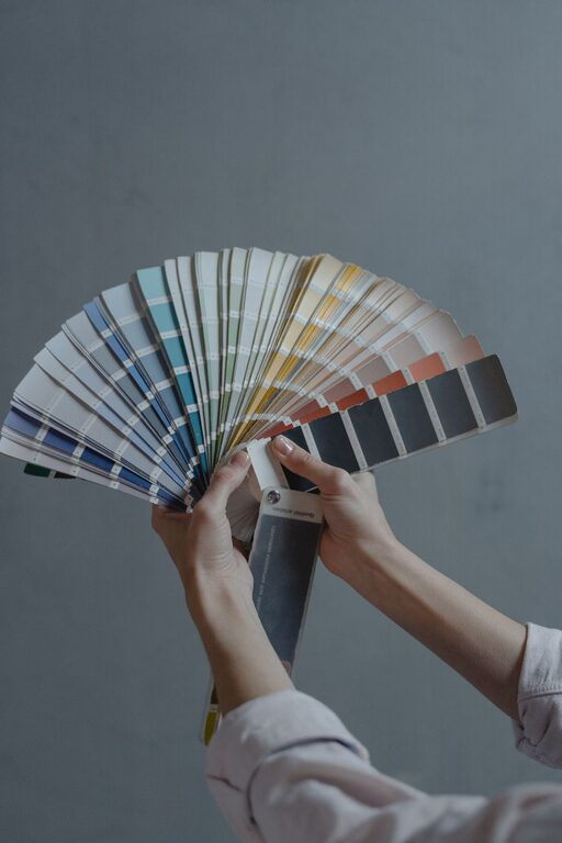
Paint swatches can look very different in various lighting conditions. Always test samples on your walls and observe them at different times of day before making a final choice. This ensures the color truly fits your vision of calm.
7. Balance with Texture and Lighting
Colors interact with the textures and lighting in a room. Soft fabrics, natural wood, and plenty of natural light complement calm colors beautifully. Consider adding textured elements like woven rugs, linen curtains, or wooden furniture to enhance the calming effect.
Popular Calm Color Choices and Their Effects
Here are some popular calm colors to consider and what they bring to a room:
| Color | Effect | Best For |
|————–|——————————|——————-|
| Soft Blue | Peaceful, soothing | Bedroom, bathroom |
| Sage Green | Restful, natural | Living room, kitchen |
| Light Gray | Modern, neutral, serene | Any room |
| Pale Lavender| Gentle, nurturing | Bedroom, nursery |
| Warm Beige | Cozy, inviting | Living room, dining room |
Avoid Common Mistakes
– Choosing colors based only on trends: Trends change, but calm colors should suit your personal style and comfort long-term.
– Ignoring lighting: Artificial and natural lighting affect how colors appear. Avoid selecting colors solely by looking at paint cans.
– Overusing dark shades: Dark colors tend to absorb light and can feel oppressive if used excessively in small rooms.
– Mixing too many colors: This can create chaos rather than calm.
Final Thoughts
Selecting calm colors for your home is a rewarding way to create a sanctuary where you feel balanced and comfortable. By focusing on nature-inspired, light, and neutral tones, testing samples, and considering room function, you can design a peaceful environment tailored to your needs.
Remember to have fun with the process! The perfect calm color palette will make your home a welcoming retreat that supports relaxation and well-being every day.